Theatre design and book illustration are very different.
Whilst Salisbury (2008, p.23) suggests marginalisation of illustration as an art form, I wonder if theatre set design could indeed be the black sheep of the arts family? They are different classifications of art qualifications, it is live action that takes place in front of the settings, the size/scale is naturally a lot larger, the viewers all have different viewpoints and therefore different experiences and theatre design does indeed have an actual, physical three dimensional space in which to operate. Despite these differences (and many more besides), I feel there is a lot to learn from the discipline to maybe see how the practitioners deal with similar issues. For instance, how to be economical with the amount of different changes, how to create great depth on a relatively narrow stage, and how to add interest when proposing a scene.
It is this final question that I begin with. Nikolajeva & Scott (2006, p. 62) also propose similarities in picturebook settings and theatre set design “…which can be realistic or symbolic, elaborate or simple”. Whilst not of a great surprise, inspiration can be harvested from their use of layers, stylisation, colour and texture, as shown in figs 2-5. Oddey and White (2006, p. 18) propose “Scenography is no longer ornamentation, but rather the body, which is intrinsic to the media of theatre culture”. It is this potential within the scenery of both a book and stage backdrop that I have been trying to utilise throughout my experimentation and research. Much like the fans in a football stadium are likened to a ’12th man’, I feel the backdrops could be akin to an extra character / element rather than simply a frame to a picture.
In the same chapter, an interesting concept arises. “Research… has suggested that the larger the image, which is projected or transmitted, the greater the presence responses from the spectator.” (2006, p. 19) I wonder if the use of large, bold images and extreme scaling of elements in a backdrop may give more impact, rather than concentrating on small details required to add interest and realism. It is this paradox that is often the decision of the illustrator and publisher and what feels right for the story. By flattening images and creating a more 2D feel to book illustrations, I believe it lends itself to this use of large, bold images, used by Chris Haughton, that I so admire.
It is exactly this use of large-scale, bold images that held my interest when researching set design. Fig. 1. is taken from a set design by Ken MacDonald from ‘The Overcoat’, where 22-foot nibbed ink pens descend from the rigging system and dwarf the rest of the architectural office. It is this sense of proportion that I feel is used well in modern, contemporary stage design, yet often not used in children’s illustration, possibly due to a preconceived (and arguably incorrect) assumption that children wouldn’t be able to comprehend this imbalance of scale. However, like my experimentation with scale I feel it is indeed appropriate and comprehensible, whilst at the same time, possibly simply more fun and engaging?! Without sounding too cliche, is a book not meant to take us to a fantasy place, to entertain and inspire? Surely being OTT and exaggerating is good sometimes?! certainly many Hollywood movie directors feel the same!
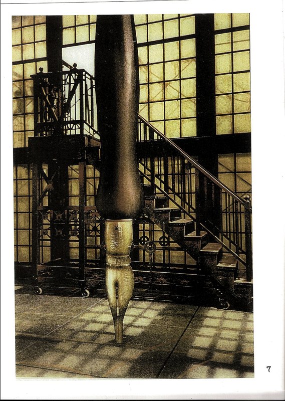
Fig. 1. Set design for ‘The Overcoat’ by Ken MacDonald
Rewa (2006, p. 133), quoting the work of MacDonald argues “such scenography does not seek to be understood as a two-dimensional landscape captured in the frame, rather such scenography performs itself.” agreeing with Oddey and White’s opinion of requirements of a backdrop / scene.
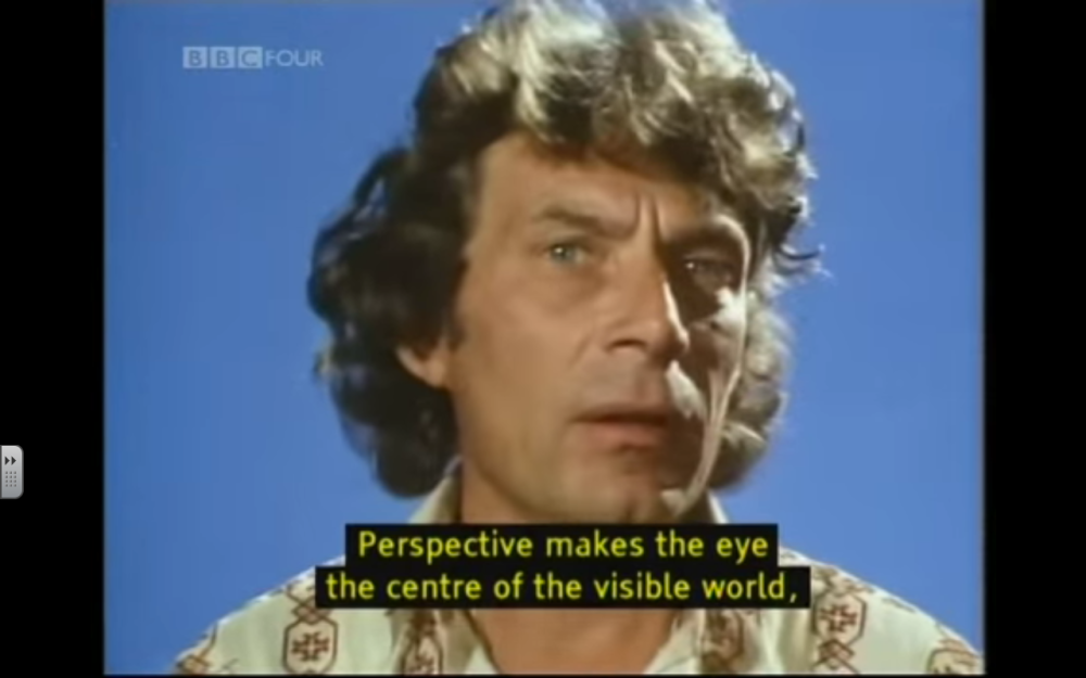
Concerning my initial question / foci, Natalie Rewa talks of an interactive space – engaging the audience. “…scenography is often characterized as linear perspective, represented as the view through a window, therefore, pictorial and graphically depicted as a cone emanating from the eye of the spectator, which arrests the object on an imaginary screen, interposed between the viewer and the object.” (2006, p. 122) It is this ‘window’ that engages the audience / reader, and there are different ways to achieve it. I think that too often picturebooks aim for this immersive environment with a realistic image. With (or possibly especially with) postmodern picturebooks, it is a trend for illustrators to “…utilize these three traditional spatial dimensions, (and have an) atmospheric quality; translucent and mobile” (Goldstone 2008, p. 119). Rather than trying to deal with a realistic immersive environment, I think that immersion for the reader / audience can occur even without this realism. The skewing and manipulation of scale, perspective, and character / backdrop differentiation are all part of this process.
In Robbins’ article ‘Theatre and Design’ she discusses “(Wagners set designs that were) moved singly and regrouped in clusters to create an almost endless set of configuration” (1990, p. 28). In a similar way, it is advisable that illustrators be rather astute with their constant reproduction of new images for each setting and page, especially considering the sheer volume of work a modern illustrator needs to produce in order to maintain a healthy income, whilst at the same time, ensuring the almost comical repetition of setting in Tom & Jerry chase sequences are avoided.
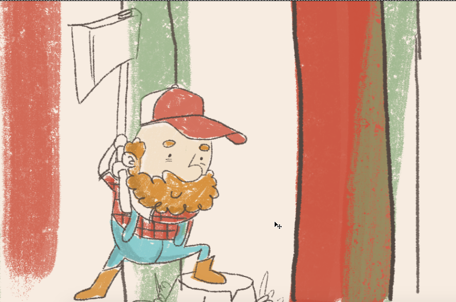
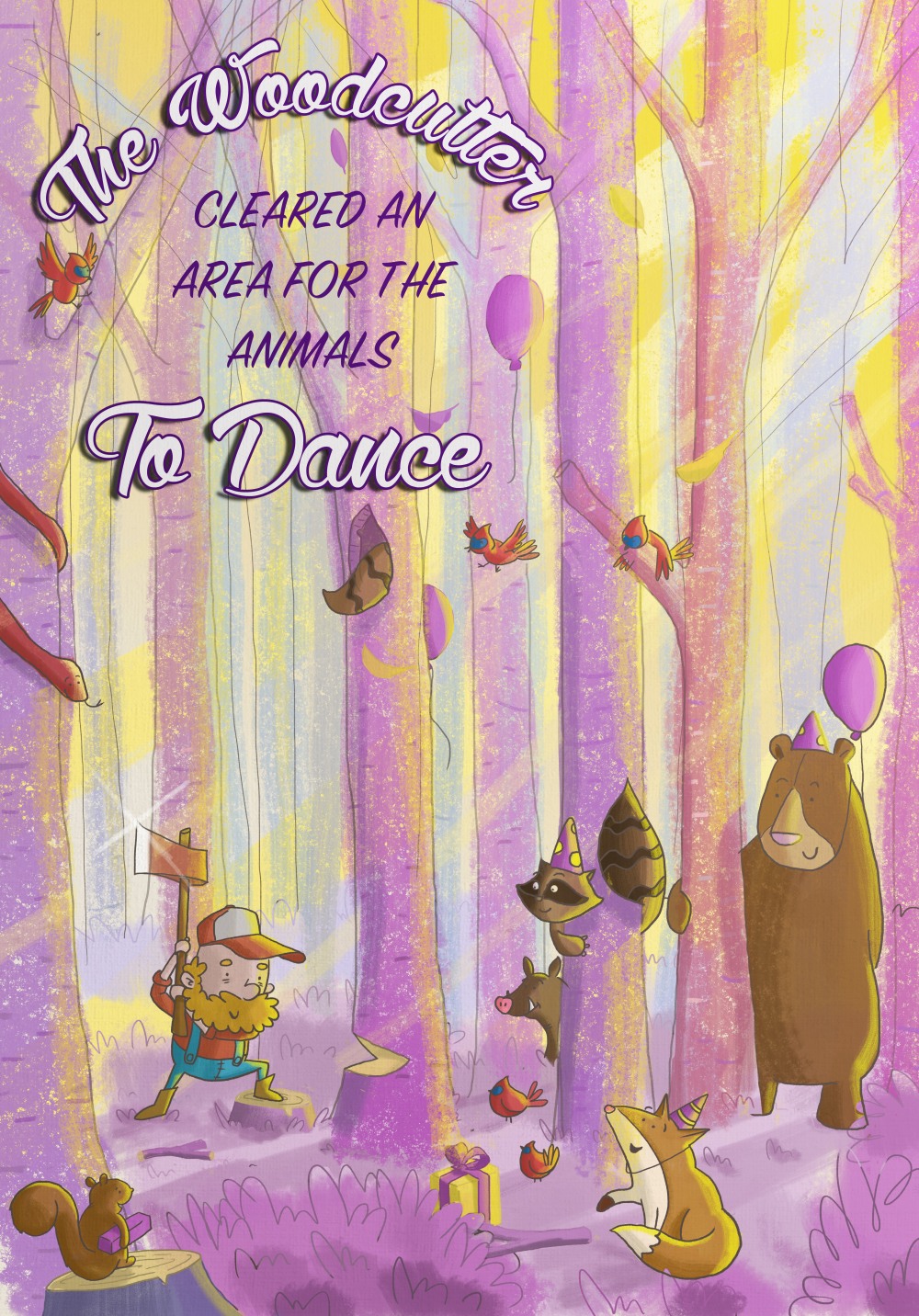
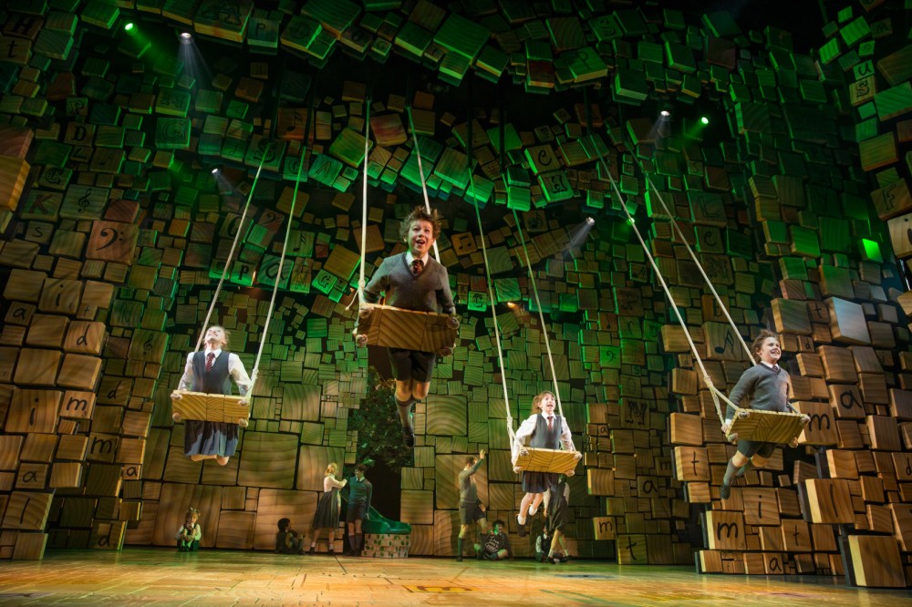
Comparing my previous interpretation of a forest, I researched a few interpretations in the theatre to see how it was approached. Likened to a picturebook, there were unsurprisingly a range of approaches, from the minimalistic (fig. 2) and abstract (fig. 5) to the effective use of lighting and props to create a more realistic forest setting (fig. 4). Nikolajeva (2010 p. 31) suggests complex images in a picturebook “…compel the reader to stop and browse”, I suppose it may be true for theatre design, although I feel that Nodelman’s (2010, p. 18) views on the relationship between simple text and complex images may hold true for theatre also. The more abstract / mature theatre shows having often minimal set design, where as shows for the layman tend to have more obvious backdrops. I suppose it obviously depends on the mood that needs depicting in a theatre show, maybe rather than the intended audience, and maybe this is something I could learn from set design. Forget I am illustrating for children, and simply illustrate, period. Much as my illustration preferences have begun to favour, looking at the depictions of trees and forests shown below, I know which ones I find more interesting and fun…

Fig. 2.

Fig. 3.

Fig. 4.

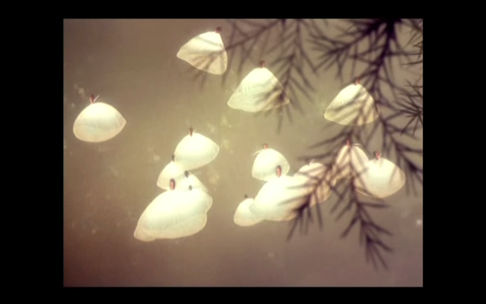
Fig. 5.
References
Fig. 1. Ken MacDonald, Pens and Figure, 1997. http://www.2x2ltd.com/Gallery.html#31
Fig. 2. Scene from Frank Wedekind’s Lulu, directed by Robert Wilson, 2011. http://theredlist.com/wiki-2-20-881-1400-view-topics-2-profile-tree-forest.html
Fig. 3. Scene from The Lion King, 2006. http://theredlist.com/wiki-2-20-881-1400-view-topics-2-profile-tree-forest.html
Fig. 4. Scene from Don Giovanni at the Salzburg Festival, 2010. http://theredlist.com/wiki-2-20-881-1400-view-topics-2-profile-tree-forest.html
Fig. 5. Jean Denis Malclès, set deign from Becket or L’Honneur de Dieu, 1959. http://theredlist.com/wiki-2-20-881-1400-view-topics-2-profile-tree-forest.html
Goldstone, B. (2008) ‘The Paradox of Space in Postmodern Picturebooks’. In Sipe, L. R., & Pantaleo, S. (eds.) Postmodern Picturebooks: Play, Parody and Self-Referentiality. New York: Taylor & Francis.
Nikolajeva, M. (2010) ‘Interpretative Codes and IMplied Readers of Children’s Picturebooks’. In Colomer, T., Kümmerling-Meibauer, B. & Silva-Díaz, C. 2010, New Directions in Picturebook Research, New York: Routledge.
Nikolajeva, M., & Scott, C. (2006) How Picturebooks Work. New York: Routledge.
Nodelman, P. (2010) ‘Words Claimed’, In Colomer, T., Kümmerling-Meibauer, B. & Silva-Díaz, C. (eds.), New directions in Picturebook research, New York: Routledge.
Oddey, A. & White, C. (2006) ‘Introduction’. In Oddey, A & White, C. (eds.) The Potentials of Spaces – The Theory and Practice of Scenography & Performance. Bristol: Intellect Books.
Rewa, N. (2006) ‘Scenographic avant-gardes: Artistic Partnerships in Canada’. In Oddey, A & White, C. (eds.) The Potentials of Spaces – The Theory and Practice of Scenography & Performance. Bristol: Intellect Books.
Robbins, C. (1990) ‘Theatre and design: Costumes, sets and lights’. National Forum. 70 (3), 28.
Salisbury, M. (2008) ‘The Artist and the Postmodern Picturebook’. In Sipe, L. R., & Pantaleo, S. (eds.) Postmodern Picturebooks: Play, Parody and Self-Referentiality. New York: Taylor & Francis.